Faithless - Insomnia

Thursday 20 February 2014

History of the genre


Dance genre - Dance music is music composed specifically to facilitate or accompany dancing. It can be either a whole musical piece or part of a larger musical arrangement. In terms of performance, the major categories are live dance music and recorded dance music.
Here is a list of some of the sub genres of the dance genre:
  •        Trance
  •        Garage
  •        House-deep house-progressive house
  •        Electro
  •        Indie
  •        Dub step
  •        Techno
  •        Jungle
  •        Drum and bass
  •        Electronica
  •        Trap  
  Faithless - insomnia is a mix of House, Trance and dream house.

History of house:
House music is a genre of electronic dance music that originated in the American city of Chicago in the early 1980s. It was initially popularized circa 1984 in Chicago, but beginning in 1985, it fanned out to other major cities across North and South America, as well as Europe and later Australia. Early house music commercial success in Europe saw songs such as "House Nation" by House Master Boyz and the Rude Boy of House (1987) and "Doctorin' the house" by Coldcut (1988) in the pop charts. Since the early to mid-1990s, house music has been infused in mainstream pop and Dance music worldwide.


Our different prints


This is a video created of all of our different prints that we have created for the mag ad and the Digpack

Wednesday 19 February 2014

Rought cut 3


Things we have changed:

  • Many little tweaks to different things to improve the video.
  • cut down the amount of shots in the woods location as feedback suggested this was boring.
  • The scene in the underpass is considerably different with a quicker pace and more shots.
  • Many many different shots in the new cafe location. I have used fast paced editing to make this more entertaining. 
  • new train scene editing and footage, the chair was also in this bit of editing for our ending. However feedback suggested we should not carry this ending forward as it is not as creative as the other parts of the video.
We also created with special effects a new chair scene with alternating chairs, this believe works effectively as it goes with the beat and looks very unique.


As well as adding a new scene with the chairs we also used the graffiti wall to a good effect and edited in 3 of me onto the wall. When shown to a range of people in my target audience they liked it a lot as they thought it was a really good effect.


Numerous new shots in the new location of the cafe scene. This emphasises the characters insomnia by the fast paced editing and the numerous amount of sugars he puts in his tea.

Tuesday 18 February 2014

Rough Cut 2 Audience feedback

We got an extensive amount of research for our second rough cut from our primary target audience, we had them write down their thoughts onto sheets of paper. Once we had gathered them all up we began to categorise them and highlighted the main points.


One reason that was highlighted here, was that we had our primary target audience correct. As one of the pieces of feedback we got from the year ten class which are aged 14-15, was that only two of the people in the class of 30 knew what the track was. Also another factor was that none of them would put the song on their ipod.

In contrast to the year 12 class 50% of them recognised the track and 75% of them would put it on their ipod. The year 12's are aged 16-17 which matches our target audience (15+24) Therefore from this feedback we are clear that we have our primary target audience set correctly. The only fault was that some people mentioned that 15 may be too young. However, we disagree with this. Although the BBFC don't currently age rate videos they are going to start as this post highlights BBFC plans to introduce age ratings.   

The black and white effect seems to be very popular amongst our target audience. We were pleased with this feedback as we feel it really sets a mood for the music video and people do like the dark tone it gives.

One piece of negative feedback we received which we feel the need to act upon is the loss of emphasis towards the end of the video.

Wednesday 12 February 2014

CT: Mag Ad Research

This is some of the research i have done on Faithless' past magazine ads, cd cover and DVD cover. I got this research from a number of different websites which helped me when i was designing the magazine ad for our production.


Friday 7 February 2014

CT: Rough Cut 1: Audience Feedback


Rough Cut 1: Audience Feedback

This is our audience feedback for the first rough cut we created. the feedback we gained was both positive and negative which is what we were after. One thing missing from this is more feedback from our secondary target audience - this is what we will get when we produce further rough cuts.

Saturday 1 February 2014

My audience research


I am going to ask many different questions to our target audience on our sample sequence to get feedback which will improve our final Piece. We will take this advice, which will hopefully influence what set ups and locations we choose. Also how we go about making our video. Here is our sample sequence:
  • Do you think this idea is appropriate for the target audience? 
  • What do you think works best in this sample? 
  • Is there anything you might change/add to make this work better for this audience?
  • Are there any videos we look at for further ideas?
  • If you don’t think this is appropriate for our target audience, who would you suggest we target it at?
  • Any thoughts on how we might utilise social media to promote this?

CT:Magazine Ad Drafts Summary

These are our magazine ad drafts.


1.


2.


2.


3.


Half page ad


THURSDAY, 16 JANUARY 2014

Magazine Ad design

Following my magazine ad research i began to start designing a rough draft for what our magazine advert would look like. following the main conventions i came up with some rough magazine ad ideas. I will then gain feedback and go ahead with the best design.

Mag ad sheet 1
Mag ad sheet 2

Above are my first initial ideas for our  magazine ad and i have began to design the ones i think would fit best with our audience.

I began with the font which i downloaded from a website called TenbyTwenty this offers users the choice to download a number of different fonts. I thought the font Nevis fitted in similarly to the one are artist uses on their website. 


As you can see there is as a similarity between the two which is why i wanted to use this one.

Another font i particularly liked was this dymo font which is similar to the one paramount use for their ident.


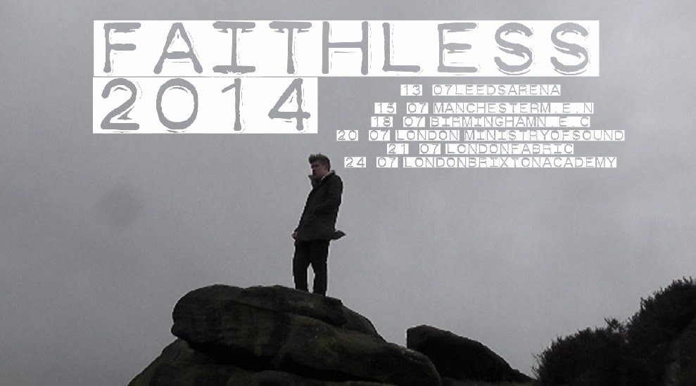
This is a rough draft of one of my designs.


Obviously this needs some more exposition on the ad but this is my first rough idea.

For the second draft i decided to try out a different font from the website Dafont.

For the second draft we wanted to include tour dates for our act as this is a main convention for magazine ads. I found a number of past tour dates on their website.

One thing i recognised was that our artist does a number of shows rather close together then has a few weeks before his next gigs eg. 6th, 8th, 9th of march then the next gig would be 30th and the 31st. So this is something we are going to include.

As our artist is recognised internationally his gigs are all over the world. However, we want to narrow ours down to Uk tour dates rather than international. As well as playing gigs and concerts our artist plays at festivals also so this may be something we include.


On our sixth shoot we took the pictures we needed for our magazine ad, this meant that we would be able to create a teaser ad as well, the pictures are below.


This is a first draft of a teaser ad.

I do not like this one at all here is another example of a teaser with a new downloaded font.

This is one of our draft teaser ads with different font colours as the white one didn't link in with the back ground image.

With the black font it stands out a lot more in comparison to the white one.

Tube station themed mag ad.